D6 - Handling forms in Vue 3
Vue.js comes with a lot of features that make working with forms easier out of the box, like the reactivity and events with modifiers and the two-way binding system on top of it.
Learning to work with forms properly in our favorite frameworks is valuable, and it can save us some time and energy during development
When dealing with forms on the frontend, we often need to sync the state of form input elements with corresponding state in JavaScript. It can be cumbersome to manually wire up value bindings and change event listeners.
<input :value="text" @input="event => text = event.target.value"/>V-model
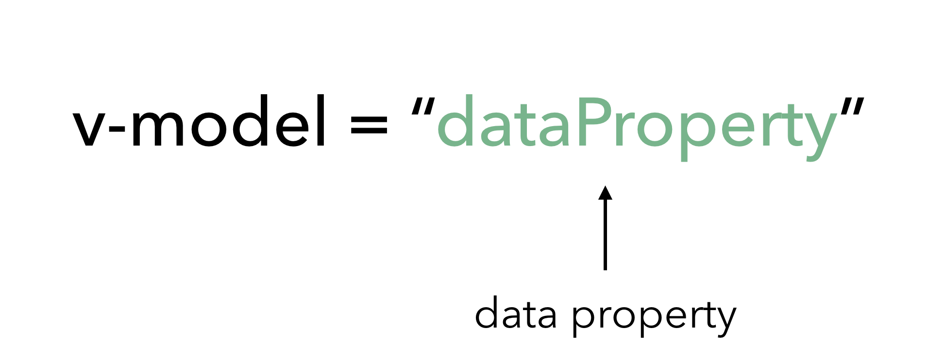
The v-model directive creates two-way data binding between form inputs and text area elements. In other words, v-model directly binds user input with a Vue object’s data model that as one changes, the other automatically gets updated.
The v-model directive helps us simplify the above to:
<input v-model="text"><input>with text types and<textarea>elements usevalueproperty andinputevent;<input type="checkbox">and<input type="radio">usecheckedproperty andchangeevent;<select>usevalueas a prop andchangeas an event.
<script setup>import { ref } from 'vue'const message = ref('')</script><template> <p>Message is: {{ message }}</p> <input v-model="message" placeholder="edit me" /></template>Text-area
<script setup>import { ref } from 'vue'const message = ref('')</script><template> <span>Multiline message is:</span> <p style="white-space: pre-line;">{{ message }}</p> <textarea v-model="message" placeholder="add multiple lines"></textarea></template>Check-boxes
Checkbox inputs naturally have a boolean value which dictates whether the checkbox is checked or unchecked.
<script setup>import { ref } from 'vue'const checkedNames = ref([])</script><template> <div>Checked names: {{ checkedNames }}</div> <input type="checkbox" id="jack" value="Jack" v-model="checkedNames" /> <label for="jack">Jack</label> <input type="checkbox" id="john" value="John" v-model="checkedNames" /> <label for="john">John</label> <input type="checkbox" id="mike" value="Mike" v-model="checkedNames" /> <label for="mike">Mike</label></template>Radio
Radio inputs usually have custom values specified with them, we’ve set the expected values for each radio input alongside the v-model directive.
<script setup>import { ref } from 'vue'const picked = ref('One')</script><template> <div>Picked: {{ picked }}</div> <input type="radio" id="one" value="One" v-model="picked" /> <label for="one">One</label> <input type="radio" id="two" value="Two" v-model="picked" /> <label for="two">Two</label></template>Select
v-model will bind the value of the option selected to the subject data property. We’ve set a value of an empty string (which is also the initial value of the subject property) to the first disabled option as to have it selected when the application first renders.
<script setup>import { ref } from 'vue'const subject = ref('')</script><template> <span> Selected: {{ subject }}</span> <select v-model="subject"> <option disabled value=""> Select dropdown </option> <option>Engineering</option> <option>Computer Science</option> <option>Biology</option> <option>Other...</option> </select></template>